
This article was originally published in French in Les carnets de l'Ocim (April 2025). English translation.
How do you create an aesthetic, effective, interactive, modular and environmentally responsible exhibition, while planning for touring from the outset? Is it possible to bring such a project to life without institutional backing? The creator of the art & science exhibition COLOURS shares her experience of independent design and production, where creative freedom meets the need for versatility and a measure of calculated risk. A bet that paid off.
Creating an exhibition from scratch, outside any institutional framework, questioning every stage of its design and development in order to put the essentials back at the heart of the project: that was the challenge I set myself. What are the essentials? For me, it means privileging simplicity and effectiveness by making clear priorities: audiences, uses and respect for the environment.
Passionate about science, art and culture, with a PhD in physics and a background as a heritage curator, and since 2018 an entrepreneur, I embarked on this adventure, which led to the creation of the travelling art & science exhibition COLOURS.
First presented at the Cellier de Reims in late 2023, the art & science exhibition COLOURS was hosted in 2024 by the Musée de la Corderie Vallois (Rouen Metropolis) for the Normandie impressionniste festival. It continues to tour France and internationally.
Here I describe the choices I made and give a glimpse behind the scenes of this adventure.
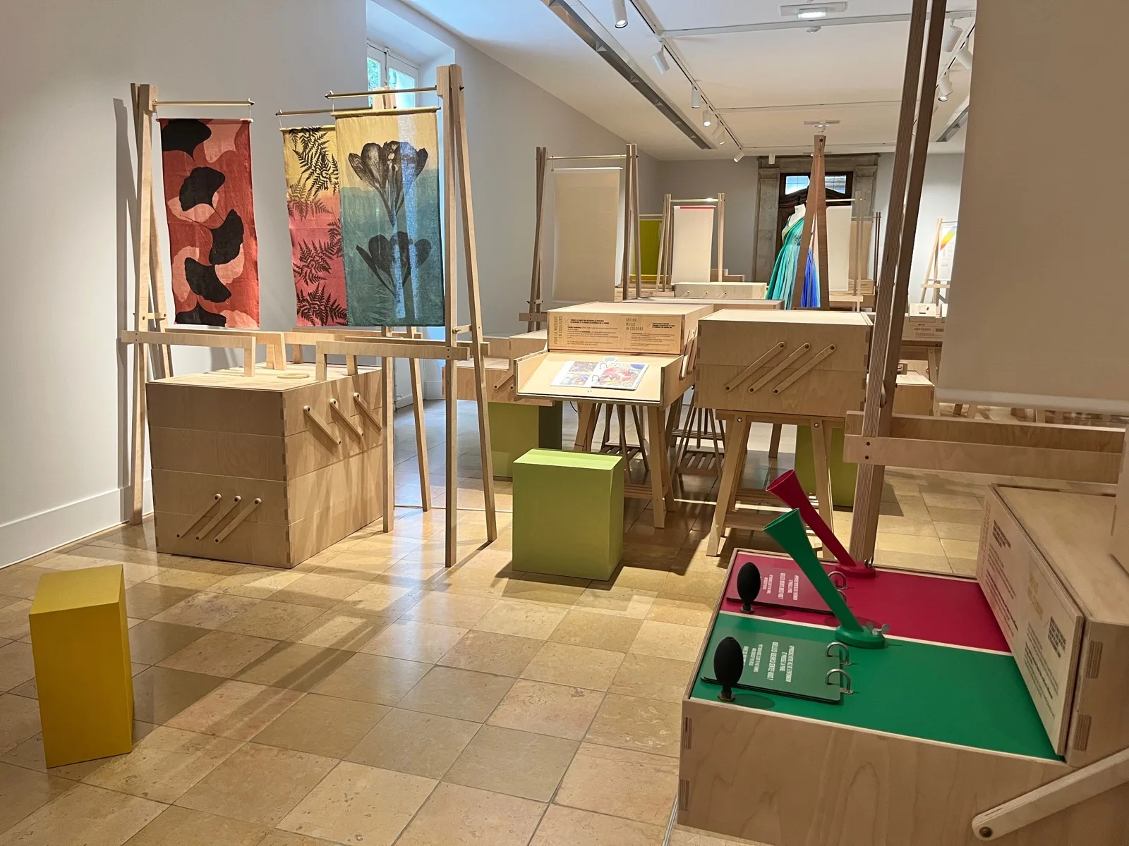 The COLOURS exhibition, an original creation by MuseoScience, here at the Musée Hébert
Sharing and transmission: putting the public at the heart of the project
A mixed and universal approach — between “museum” and “science centre”
When I entered the world of museums through the Institut national du patrimoine (INP — France's national school for heritage curators), I was struck by the dichotomy in the cultural landscape (at least in France) between museums on one side and science centres on the other. Museums are defined by their nature and by law through their heritage collections, whether art, taxidermied animals, or ethnographic and technical objects. They favour the presentation of authentic, heritage objects. Science centres, generally without collections, are spaces dedicated to scientific culture, emphasising public engagement, experimentation, play and learning.
While some bridges exist today, these two worlds remain very separate, with a relatively impermeable boundary — certainly of historical origin and reinforced by the distinct legal status of these organisations, as well as by the divergent profiles and training paths that lead to working in them.
In my view, we have everything to gain by drawing on both approaches to offer a third, mixed way, to broaden the audiences we reach. By combining authentic objects with interactive experiments, placing equal emphasis on beauty, play and learning, we offer the public a rich and varied experience that can engage children and adults alike — whether they come to see beautiful things or to learn, to wonder, to enjoy or to experiment. This is the universal approach I chose for the art & science exhibition COLOURS. Visitors discover physics experiments and sensory experiments, games, as well as real objects and contemporary artistic works.
Colour is a universal subject that has always fascinated me through its ability to cross all disciplines and to create surprise. It lends itself to an approach that weaves together art and science, nature and culture. To immerse oneself in the vertiginous world of colour is to question our perception of the world, to examine our relationship with reality, our habits and our preconceptions. Colour carries within it that universal quality that “speaks to everyone”, that accessibility concealing great scientific depth, that sense of wonder, and finally that direct relationship with materiality and the real — values I believe to be essential.
Designing and creating simple yet profound experiences
The “Colour spinning tops” exhibit presents a disc divided into sections, alternating red and blue segments. By turning a crank, you set the disc spinning. The colours blend. The eye no longer perceives the red or the blue: it sees pink. A simple, striking experiment that speaks for itself. Even without reading the label, you immediately perceive an effect. You are surprised and take something away from the experience. The explanatory label allows you to go further. The pink is not present on the disc — it appears in our minds. The brain “invents” colours: colour is not a pure property of matter; it is a sensation perceived by the eye and interpreted by the brain.
This is what I call a simple yet profound experience: it is an immediate gateway into rich and serious content. But one should not be deceived. Achieving a simple, almost self-evident result requires a great deal of work, trials, errors and creativity.
The starting point was an experiment I discovered through the website 123couleurs.fr, created by two physicists passionate about colour, Sylvie Zanier and Julien Delahaye (1), whom I contacted and who became genuine partners on the project. The original experiment involves spinning a small coloured cardboard spinning top and watching the colours blend.
The aim was to transform this experiment into a robust, permanent exhibit that would work autonomously in the exhibition, built to last several years. The idea was also to change scale — from a small “individual” format to a much larger “collective” format: so that when one visitor turns the spinning top, others nearby can see what is happening at the same time.
The first proposal, designed with the exhibition designers (Nuüd Studio) and the manufacturer (Ateliers Saint-Roch), was a 30 cm diameter disc fixed to a rotating axis, which visitors would turn by hand. An excellent idea on paper. But when we came to realise it, we had the unpleasant surprise of finding that it did not work. The colours did not blend. The problem was that by hand, it was impossible to spin the large disc fast enough, unlike the small cardboard spinning tops. We tested a modification to the size of the sections on the disc, with more frequent colour alternation. Without success.
An easy solution would have been to add a motor — easy but not satisfactory: I preferred to remain with something more direct, more immediate, a “low-tech” exhibit, without artifice. The manufacturer then devised a system with a crank and belts, like a bicycle mechanism, to spin the disc very fast without needing much force. The new tests proved very successful.
The example of this exhibit shows how a brilliant idea can prove disappointing in execution — or even a complete failure — if one does not take the trouble to test it and make the necessary adjustments until a convincing result is achieved. An exhibition is as much lived and experienced as it is conceived.
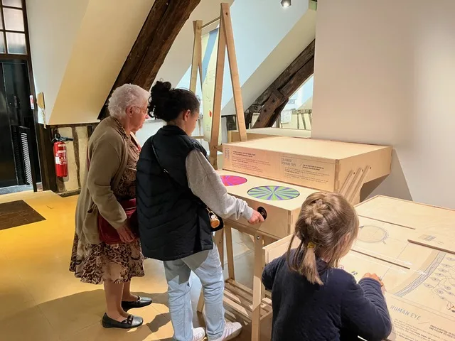 Colour spinning tops. The COLOURS exhibition by MuseoScience, here at the Musée de la Corderie Vallois
For everyone — children and adults alike
It can be difficult to engage all ages at once. In particular, exhibits for very young children, pre-readers, require a very specific approach, both in terms of content and form. Nevertheless, in my view it is possible to reach children from ages 5–6 and up as well as teenagers and adults.
The key is to offer simple exhibits. Simple, however, does not mean trivial, nor familiar to everyone. One can imagine very simple experiments where something immediate yet surprising happens — something not seen every day — that prompts reflection and sparks debate between visitors. The simpler the understanding, the more effective it is for engaging, questioning and conveying messages. Simplicity does not preclude scientific rigour either. The subjects addressed can be profound.
The exhibition itself is not, in my view, the place for a comprehensive lesson on a subject. It is more an experience that is lived, that arouses emotions and opens doors by stimulating curiosity.
An example from the art & science exhibition COLOURS: “Colours and prejudices”. A seventeenth-century painting, The Habert de Montmor children, by Philippe de Champaigne, depicts a group of seven children. The question put to visitors is how many girls are in the group. The answer surprises, and in the visits I have led, few people — children or adults — find the right answer: the only girl in the painting is dressed in blue, while some of the boys are dressed in pink, others in a blue robe or a yellow tunic…
This quiz challenges our preconceptions about gender and colour. The label goes a little further. It explains that the symbolism of “pink for girls, blue for boys” is a recent invention, gaining momentum with the rise of consumer society. It also mentions the “pink tax” — that sexist and yet fairly widespread practice of selling the same toy, garment or razor at a higher price when it is pink than when it is blue or white…
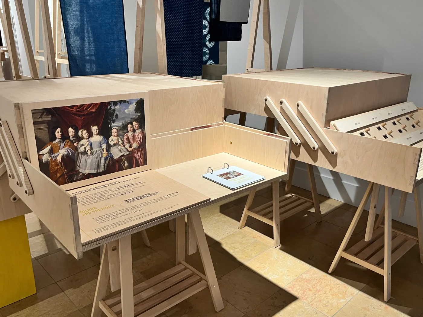 Colours and prejudices. The COLOURS exhibition by MuseoScience, here at the Musée de la Corderie Vallois
Putting it into practice through exhibition design
Reaching children and adults equally is not only a challenge for content and subjects, but also for exhibition design. It means accounting for visitors of different heights: children, adults, women, men, standing or in wheelchairs. And this is not always easy. Compromises sometimes have to be made.
When designing the exhibition furniture, we adjusted the layout so that all the exhibits are at a height low enough for everyone to see and interact with, and so that the texts are equally legible. The most difficult decision was the choice of height for the mini light theatres: you look inside a black box through a small aperture. We chose a height suitable for a six-year-old child or a wheelchair user. A cube that can be moved can serve as a seat for an adult or a step for a smaller child.
The harmony and coherence between content and form is, in my view, a key to the success of an exhibition project.
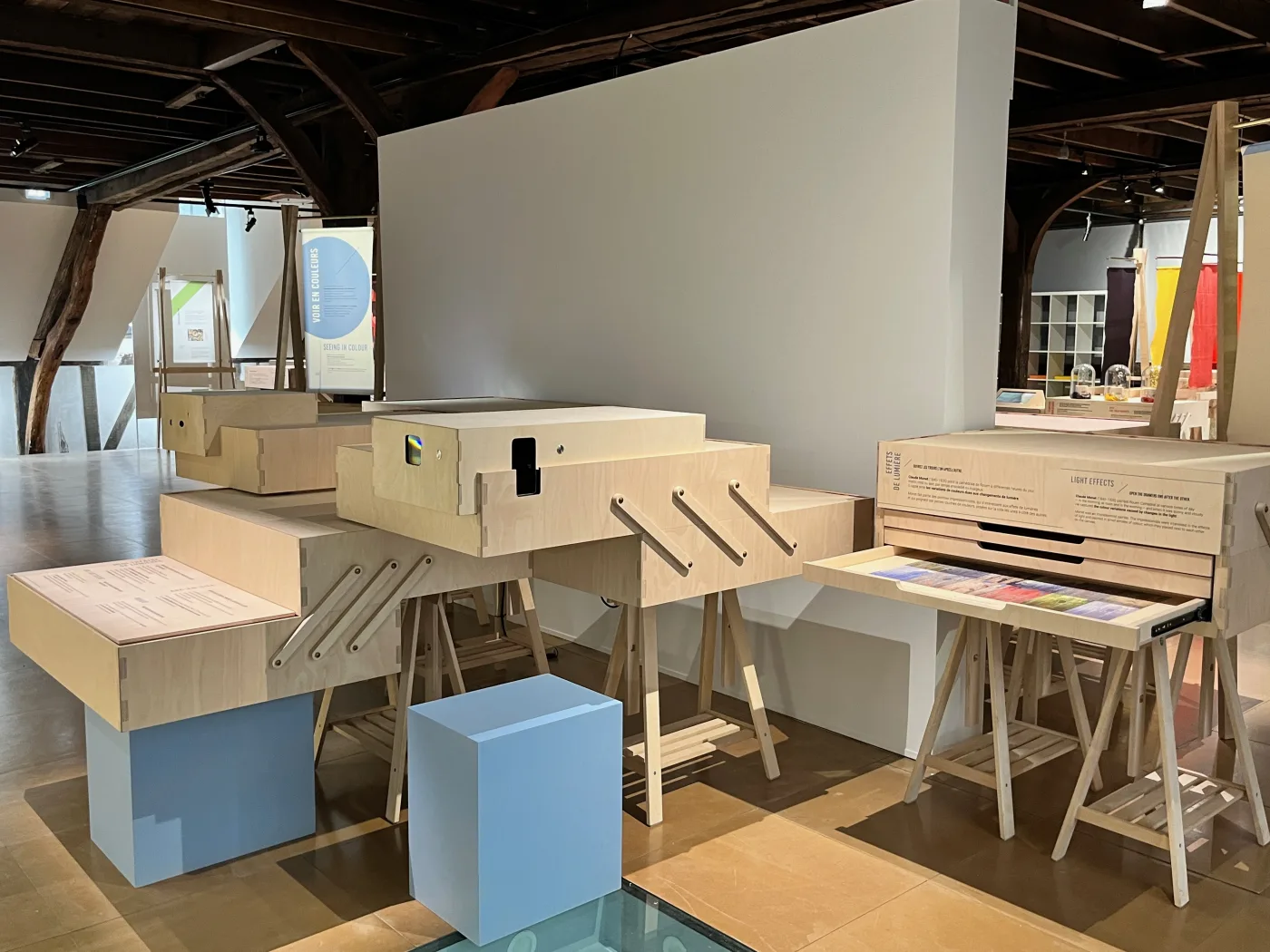 Mini light theatre. The COLOURS exhibition by MuseoScience, here at the Musée de la Corderie Vallois
Restraint, elegance and ergonomics. Prioritising use and a sustainable approach
A direct, unfiltered relationship with experimentation and materiality
For the art & science exhibition COLOURS, I chose a direct relationship with materiality and experimentation, presenting original objects and “low-tech” experiments rather than virtual ones. This choice is consistent with my commitments to sustainability and environmental responsibility — both in the initial production of the exhibits and in their use: less energy consumed, fewer maintenance concerns and less obsolescence over time.
The aim is also to offer the public an original experience, different from what one can see at home or in a cinema. Visiting an exhibition is an “in-person” experience, in 3D, sensory. It seems important to me to return to this basic principle by offering physical, real and sensory experiences, as well as a direct encounter with authentic original objects.
Splitting white light with a prism, or the blending of colours with the spinning tops, are two examples of experiments that are experienced “for real”: when one tries to film or photograph them, the result is disappointing, because a digital camera does not capture colours as our eye does. You have to attend the actual experiment to witness the physical phenomenon. This gives meaning to making the journey to visit the exhibition.
The art & science exhibition COLOURS also offers games that engage the senses: sight, but also touch, hearing and smell. It also presents original artistic works: contemporary textile pieces created for the exhibition — including a textile herbarium created in plant dye by the artist Juliette Vergne, and a “colour swatch” dress by costume designer Anaïs Mérat.
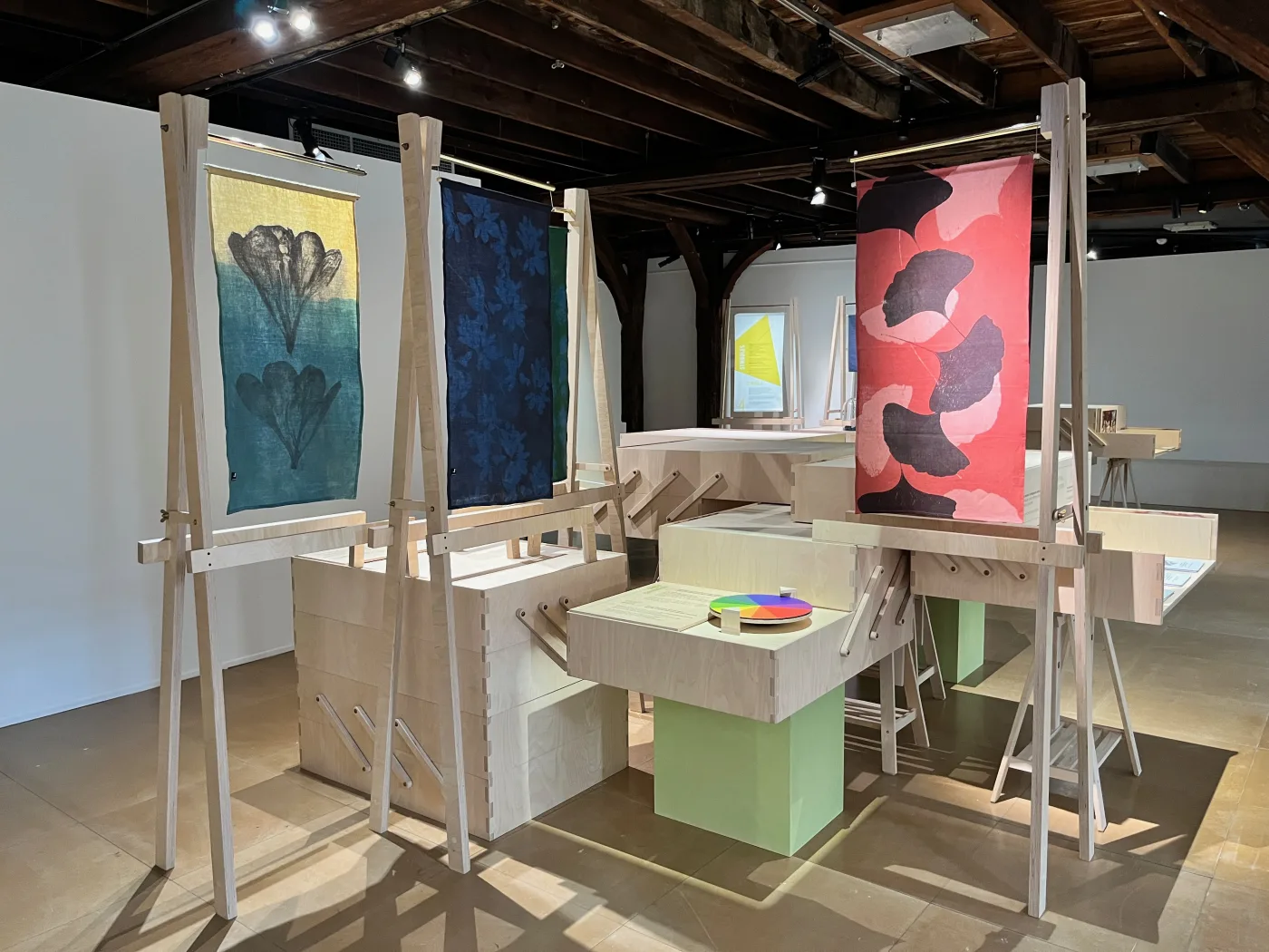 Textile herbarium, created by Juliette Vergne. © MuseoScience
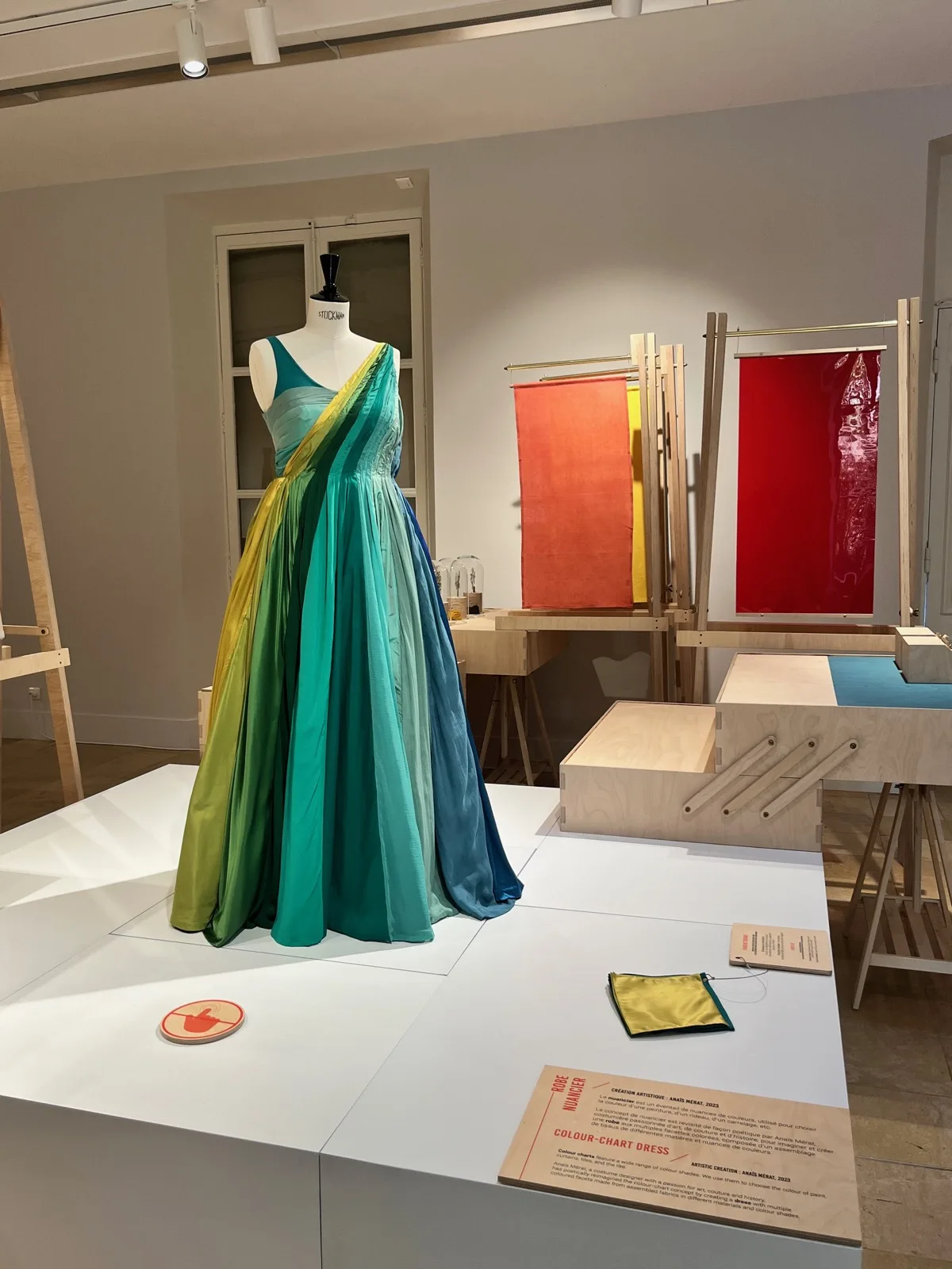 Colour swatch dress, created by Anaïs Mérat. © MuseoScience
Choosing restraint through an eco-design approach
The aim was to create an elegant, refined, ingenious exhibition design conceived for touring: light, robust, modular and optimised for transport. The challenge for the exhibition design was multifaceted. In most cases, exhibition design is conceived for a first venue, which produces the exhibition and where it is intended to be shown first. It is only in a second stage that the question of touring is addressed.
The goal here was to integrate the touring constraints from the outset, at the design stage, anticipating challenges of packing, storage, transport, installation and de-installation, robustness, adaptation, and so on — in a spirit of efficiency and eco-design. All without sacrificing the artistic dimension of the exhibition design. My ambition was to reconcile touring, sustainability and aesthetic quality. Beauty and function.
The Lille-based exhibition designers Lorianne Neveu and Matthias Delattre of Nuüd Studio rose to this challenge. They conceived a restrained, ingenious and elegant exhibition design inspired by the painter's studio. “Easels” carry printed textiles — the exhibition panels — and coloured fabrics, pieces created specially for the exhibition.
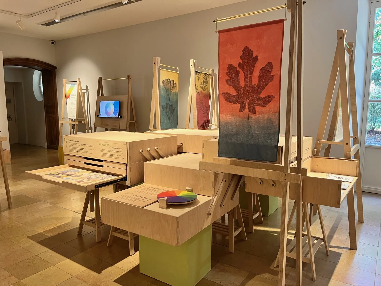 Exhibition design. Art & science exhibition COLOURS. © MuseoScience
The concept is based on repeated elements, offering great modularity in layout: the exhibition adapts to the venues that host it. The “paint box” (or sewing box) furniture pieces open up and are installed, firmly secured, on trestles and cubes. They close for transport, also serving as crates to carry the interactive elements and small objects.
Attention was also paid to heights and widths, to anticipate ceilings that are not always high and doors that are not always wide enough to access the spaces. During implementation with the manufacturer, Ateliers Saint-Roch, we took into account the dimensions of transport pallets to adjust the size of the furniture, so as to optimise packing on pallets and international transport. Respecting logistical standards is a considerable asset in addressing the challenges of storage, mechanical handling and international transport.
From the design stage, all elements bearing text were conceived to integrate elegantly into the exhibition design, but also to be easily replaceable to adapt the exhibition to other languages for an international tour — without needing to manufacture new elements or reprint visuals. The choice of restraint also appears in the choice of materials (mainly plywood) and the graphic choices, incorporating colour but sparingly, without large areas of flat colour. Always this idea of producing less. Getting to the essentials and reducing environmental impact.
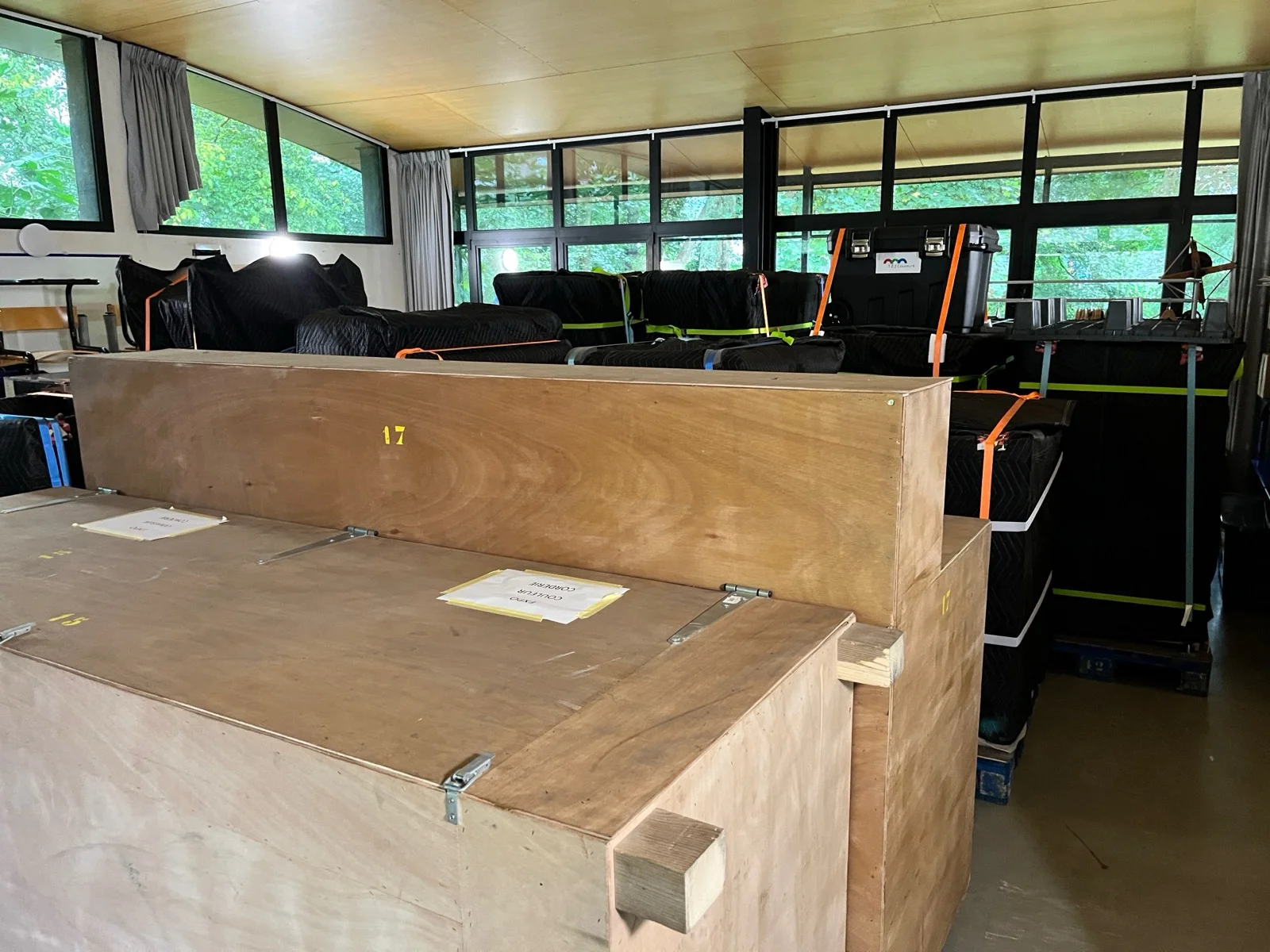 Packing and transport. Art & science exhibition COLOURS. © MuseoScience
To put these principles into practice, it was necessary — as with the exhibits — to go through phases of testing and prototyping. Ateliers Saint-Roch produced an easel and a box-furniture piece to validate the concept. We adjusted the dimensions and plans to ensure greater solidity and robustness. In particular, we decided to add fixing systems between the elements to ensure the robustness of the whole. This introduced a few marginal constraints, limiting the modularity, which remains considerable but not quite as free as envisaged at the exhibition design stage. Finally, the prints had of course to be tested: colours tend to get away from us — they are never the same on screen as when printed. Which is at the very heart of the exhibition's subject…
Conclusion
This approach — reconciling innovation, aesthetics, effectiveness, sustainability, ergonomics and environmental responsibility — resonates, as I recently came to realise, with the fundamental principles of design set out 50 years ago by the celebrated German designer Dieter Rams, an industrial designer with an architectural training. These values are, in my view, more relevant than ever today, given the environmental challenges we face.
Discover the art & science exhibition COLOURS
How do you produce a travelling exhibition as a business?
Running such a project in an entrepreneurial form, outside any institutional framework, has the advantage of offering great freedom and considerable agility. But it also means not being able to rely on everything an institution can provide in terms of financial, human, technical and logistical resources.
I had to take on many roles myself on this project, requiring agility, creativity and perseverance. I am first and foremost the curator and exhibition developer of the art & science exhibition COLOURS. As producer too, I had to devise a model — including a financial one — and manage all the administrative, financial, legal, operational, technical and logistical aspects of the project. I also handle the touring myself today: from commercial prospecting and communications to logistics — storage, transport, installation and de-installation. Of course, it was also necessary to surround myself with the right partners and collaborators: scientists, artists, exhibition designers, manufacturers, and so on.
To produce the exhibition, I wanted to maintain complete freedom and the great agility the entrepreneurial model offers. This is why I decided to carry the project through my company MuseoScience, rather than as a co-production. To produce the exhibition, I took risks: I invested my own time over several years and my own money, and took out a bank loan. The Musées de la Ville de Reims were the first to host the art & science exhibition COLOURS. Today, the exhibition has a bright touring future ahead, with Switzerland and Isère on the programme for 2025.
(1) Sylvie Zanier (Université Grenoble Alpes) and Julien Delahaye (CNRS) were recently awarded the Jean Perrin prize for science communication for their work on the theme of colours, including in particular their contribution to the art & science exhibition COLOURS.